
natecooper.net is making it appear as if all I’ve been reading is cracked.com and BLDGBLOG. Could be worse I guess. BLDGBLOG’s discussion of “extreme signage” [link] does pique my interest. I don’t know if I fully agree with the assessment of this fountain as “public signage that no one can read”. Seems to me that it may be simple enough to read if the amount of gradation is not so much on a sliding scale but on minor variations (ala red light, green light, yellow light). Furthermore I’ve often thought that Los Angeles needs more and more large scale public (art) works projects. The city is so flat and widespread that dramatically scaled structures with aesthetic value would help define the landscape better (the Watts towers not excepted).
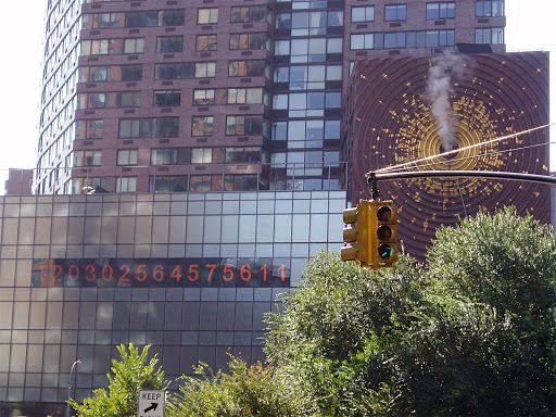
On the topic of extreme signage I’d throw my hat in to vote for the Clock in Union Square. I’ve even have it explained to me and I still feel totally inept at my inability to read it. Luckily the Gothamist has a little primer [link] if you’d like the mystery ruined.

